White labeling in a front-end monorepo: The do's and don'ts.
15 juni 2023
Defining a good structure for your theme, components, and files is key to maintaining code for multiple brands. If you're coding multiple applications within one shared codebase, these guidelines will help you out.
The use case: Maintaining code and UX for multiple radio channels
When I was a lead frontend consultant at NPO Radio, both developers and UXers were spending a lot of time managing and implementing differences between the different radio channels (different brands). There are 9 channels in total:
All of the applications were maintained within one monorepo.
A monorepo for multiple brands
A monorepo is a single repository that contains multiple applications. This is a great solution for white labeling because it allows you to share code between brands, and it makes it easy to update and deploy the applications separately.
White labeling, what is it, and why?
White labeling is the process of creating a product that can be rebranded and sold by multiple companies. Here are a couple of use cases for white labeling. Let's say you are...:
- ...a SaaS company that creates a product that can be used and rebranded by multiple clients.
- ...an agency that creates webshops for multiple clients and would like to create a product that can be re-used by all of them.
- ...a company with multiple brands or subsidiaries, and you want to create a product that can be used by all of them (This is the use case we had at NPO Radio).
In all use cases, each company/brand/client should be able to rebrand the application. In the remainder of this article, I will use the term "brand", but you can replace it with "client", "daughter company", "radio channel", "product", etc. Whatever the common denominator is in your use case.
NPO was more challenging than usual, how come?
Thankfully, I've had some experience with white-labeling applications for previous clients. However, NPO's challenge was a bit more complex because of the following reasons:
- The wide variety of differences: in data, design, and layout.
- The number of different applications/radio channels (9 in total)
- The complexity of the differences: some differences are small, like a different background color. Some differences are more complex, on that later.
- The amount of technical debt accumulated over the years. The theme object grew to 500+ lines of code.
- There are multiple approaches, of which the best choice is dependent on the context. Picking the right one is an art, not a science.
So it wasn't just slapping a new logo and color on the application and calling it a day. It's a complex process that required a lot of thought, planning, and collaboration with the UX and development team.
Let's get started!
At NPO we used React and Styled Components, but the guidelines here are applicable to any framework. It should also work just as well with SASS, CSS modules, or any other styling solution.
I'll cover 3 parts you'll have to think about when creating a white-label product in your front-end:
- Structuring your theme
- Component and file structure
- Data differences
Part 1. Structuring your theme
When you encounter variances between brands in design, layout, or data, you have to decide where to solve this:
- In a theme object/file with global variables.
- In the UI component itself, for example in a Button component.
- Within the file structure.
There are at least 3 ways you can prevent your theme from becoming a mess:
👎🏼 Don't: Add variables in the theme that aren't used by all brands.
The theme is for global variables that are used by all brands. So don't do this:
const theme = {
  //...
  borderRadius: 12,
  skewedRadius: undefined,
  //...
};
👍🏼 Do: Make sure your theme structure is the same for all brands
The complete structure, variables, and code of the theme should be the same for all brands. This is the only way to make sure that you can easily add new brands in the future. If your theme fields change for each brand, you'll have to create a new theme for each new brand. This is not scalable.
👎🏼 Don't: Put component variables in the theme
Prevent putting every difference between components in the theme like this:
// source: global theme object for a specific brand
const theme = {
  //...
  promotionCardBackgroundColor: mainAccentColor,
  promotionCardBackground: mainAccentColor,
  promotionCardTextColor: whiteColor,
  promotionCardHoverTextColor: whiteColor,
  promotionCardCategoryTextColor: whiteColor,
};
//...
As you can see, this is an attempt to apply brand-specific styling in the PromotionCard component by configuring this in the theme. The theme object will become huge, and hard to maintain. It shouldn't be the intention of the theme to control individual components. The theme should be used for global styling, like colors and fonts.
👍🏼 Do: Only add Global styling variables in the theme
Only put in global variables in the theme. Variables that can be referenced by components, but not variables that are only used by one component.
Instead of having very specific variables for specific components in a theme, we should put global styling in the theme. Stuff like colors, fonts, border-radius, spacing, etc. A great example is MUI's theme object: material-ui.com/customization/default-theme. Please take a look and notice how only global styling is affected by the theme. Also global components like a Button, but never something as specific as a PromotionCard.
👍🏼 Do: Use global theme variables in components that have the same behaviour for all brands.
Let's say you have a PageHeader component. This component is used by all brands. If each channel just has a different background color, we could just solve it via theming and referencing to a theme variable as a background color in the component.
That would look something like this:
With Styled Components
// shared/components/PageHeader/PageHeader.styles.ts

const StyledPageHeader = styled.header`
  /* Reference to a global variable instead of creating a new custom variable */
  /* So DON'T do props.theme.colors.pageHeaderColor, instead...: */
  background-color: ${(props) => props.theme.colors.secondary};

  /* ...other CSS, measurements, spacing etc... */
`;
With regular CSS
// shared/components/PageHeader/PageHeader.styles.scss

.page-header {
  background-color: var(--color-secondary);
}
Wait, what do you mean with different behaviour? The background color is different, isn't that different behaviour?
Good question! What I mean is that for all brands, the background color of the PageHeader is always the secondary color. So the behaviour is the same for all brands, but the color can be different.
👍🏼 Do: Add variables to the theme that are part of a design system
I advocate, before anything else, to invest in a good design system. The concepts I've described here are a part of that. A proper design system doesn't just indicate what fonts and colors are being used. It also determines the behaviour. Just like in the example above example.
Another example: A button has a hover effect that changes its color, to for example secondary-color. In a proper design system ALL brands use the secondary-color as a hover effect. The color can be different of course, since it's a variable, but the behaviour should be the same. So if you have a button that has a completely different hover effect for each brand, it shouldn't be in the theme. Please tell your UX designers, because this will be the icing on the cake for your white-labled design system.
Keep in mind that not all differences between brands can be solved by a design system. If the difference becomes too big, we need to start solving it by file structure and proper naming conventions. More on that later.
So this also means that if a certain design isn't part of the design system, it shouldn't be in the theme, but solved in the component itself. This is a great bridge to the next part: Component and file structure.
Part 2. Component and file structure: When the UI's behaviour is too different across brands to solve with theming.
In the PageHeader example above, I demonstrated a simple use case: the PageHeader just has a different background color for each brand. But what if the gap in design is bigger? What if the PageHeader has a different layout for each brand, or a completely different type of background?
A real use case: Different PageHeader backgrounds for each brand
Please take a look at the following variants of the PageHeader. These are all different brands, take a good look at the background:
FunX
FunX just has a gradient.

Radio1
Radio 1 has a repeating SVG Pattern.

Radio2
Radio 2 has one SVG on the right.

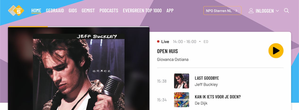
Radio5
Radio 5 has one big SVG as a background.
KX
KX has multiple SVGs, both left and right.

Uh-oh! The behaviour differs too much to solve with theming. So what do we do now?
👎🏼 Don't: Use conditional logic within one file/component
This usually happens if you try to fit all differences within a single file/component. As the title says, you don't want to end up with a lot of conditional logic in your code. It's hard to maintain. It's also not very scalable. If you have 9 brands, you'll have 9 if statements. You get the point.
The root cause, however, is still that the behaviour is simply too different and difficult to solve with theme variables.
👍🏼 Do: A baseline component that is shared between all brands, and composed.
If the difference is not solvable by having one shared component that just references some global variables, we can solve it within the component and file structure. You'll have to create a new file for each brand. Which might be look like more work at first, but it will pay off in the long run.
Example of reusing a baseline component
You have 3 brands. The first 2 have very specific differences but share some similarities. The third one is the same as the base styling. You could structure it like this:
/shared/components/PageHeaderBase component which is shared between all brands. Your baseline./brand1/components/PageHeaderSpecific for brand 1, composes/extends the shared component`/brand2/components/PageHeaderSpecific for brand 2, composes/extends the shared component`/brand3/components/PageHeaderbrand 3 just imports and exports the shared component, since there's nothing to change.`
In the below example, you can see what it can look like if I extended the shared component, and added some brand-specific styling. The shared component has the base styles. You can fill in the blanks for yourself for all the other different brands. I won't go into detail for all of them, sorry!
With styled components:
// brand2/components/PageHeader/Pageheader.styles.ts

import { PageHeaderBase } from '@/shared/components/PageHeader/PageHeader.styles';

export const StyledPageHeader = styled(PageHeaderBase)`
  /* Add brand-specific styling here*/
  background: #22282e;
`;
Here is the same idea but with CSS:
// brand2/components/PageHeader/Pageheader.styles.scss

@import '@shared/components/PageHeader/PageHeader.styles.scss';

.page-header {
  /* Add brand-specific styling here, for example a linear gradient */
  background: linear-gradient(#e66465, #9198e5);
}
Not just CSS! You can add different HTML elements, SVG's and even logic.
With this approach, you can keep the shared component as clean as possible, and only add the differences in the brand-specific components. The best part? It's not just styling! You can add different HTML elements or SVG's for a brand, or even different layouts. You can even add different logic, like different click handlers. The sky is the limit. That's why this approach is so powerful.
Here's a final example that shows how you can add different elements to a specific brand. You can import and extend the baseline component (PageHeader), and pass some components to it as children. Styled components are used here:
// brand2/components/PageHeader/PageHeader.tsx

import { PageHeaderBase } from '@/shared/components/PageHeader/PageHeader.styles';

// First, we apply the brand-specific styling to the baseline component like explained in previous examples.
export const StyledPageHeader = styled(PageHeaderBase)`
  /* Add brand-specific styling here*/
  background: #22282e;
`;

// On top of that, we can add whatever brand-specific elements as children to the baseline component.
// We pass the elements as children, but the components can also be passed as props.
const PageHeader = () => (
  <StyledPageHeader>
    <SVGWrapper>
      <LeftSvg />
      <RightSvg />
    </SVGWrapper>
  </StyledPageHeader>
);
For regular CSS, just imagine that instead of a StyledPageHeader, you have a regular HTML element with a class called .page-header.
Part 3. Data differences: Conditions are okay now
Sometimes, the behaviour of a component or view changes based on the incoming data from the backend/API.
What do I mean by differences in data?
Let's say you have Brand 1. It has an object with data that looks like this:
const data = {
  title: 'Brand 1',
  description: 'This is brand 1',
};
And brand2 has an object with additional data that's only relevant for brand2:
const data = {
  title: 'Brand 2',
  description: 'This is brand 2',
  extraData: 'This is only relevant for brand 2',
};
👎🏼 Don't: Write conditional logic per brand
Don't do this (example is in React, but the same applies to other frameworks):
const Card = ({ data }) => {
  return (
    <div>
      <h1>{data.title}</h1>
      <h2>{data.description}</h2>
      {brand === 'brand2' && <h3>{data.extraData}</h3>}
    </div>
  );
};
👍🏼 Do: Conditional logic for the field
Do this:
const Card = ({ data }) => {
  return (
    <div>
      <h1>{data.title}</h1>
      <h2>{data.description}</h2>
      {data.extraData && <h3>{data.extraData}</h3>}
    </div>
  );
};
While I realise this is the simplest example, you'll have to keep this approach in mind for more complex data structures and differences as well. Your components will become hard to maintain if you add conditional logic per brand. You won't remember what brand uses what logic. Instead of worrying about that, focus on the component design itself.
Also, be aware that this is not a silver bullet. If you have a lot of conditional logic in your components based on data differences, it might be a good idea to start splitting up the component per brand and extending/composing as I mentioned in part 2.
Finally, you'll have to make sure the data itself is structured in a way that makes sense. This will require some collaboration with your backend team.
The biggest takeaway
If there is one big takeaway I want you to remember, it's that you should try to solve differences by file structure and proper naming conventions instead of conditional logic or overstuffed themes.
If you have any further questions or suggestions, feel free to reach out to me!